Case Study:
ShowWeGo
Roles: UX Researcher, UX/UI Designer
Tools: Figma, FigJam, Photoshop, Google Slides, Zoom, otter.ai, chatGPT
Timeline: 10 weeks (Feb - April 2024)
The Challenge
Identify an existing problem space that can be addressed by a digital intervention.
Methodology: Double Diamond design process
Spurred but a frustrating experience at a concert, I decided to address improving event experiences for people with disabilities. That proved to be a huge undertaking, so the scope was narrowed to persons that are deaf or hard of hearing.
Discover, Define, Develop, Deliver
Discover
Time to get researching. I was looking for evidence of the problem, and needed to ensure I would be designing for a viable market.
Research included qualitative and quantitative data, as well as attitudinal versus behavioral data.
The Problem
I immediately found a lot of information about event accessibility issues. Time after time it was issues with ticketing and venues. But I needed to design for the user. My conclusion:
To ensure that deaf or hard of hearing individuals can anticipate enjoying live events, several resources and accommodations are needed, but are often inaccessible.
Research Objectives
what accommodations deaf or hard of hearing users need in order to have enjoyable experiences at live events
a comprehensive list of needed resources and services to ensure users have accessibility and a positive experience
a way for these users to share their service bookings, contact information, and reviews so others can have real-time resources
Understand
Only a small percentage of Deaf people can sign. helloasphyxia1
Too many instruments at once can sound like white noise for those listening with hearing aids and cochlear implants. Vocals are often lost and cannot be distinguished from the backing instruments. helloasphyxia1
Some Deaf people rely on sign language and are not skilled at reading English, while many deaf and hard of hearing people do not sign and so they rely on captions. helloasphyxia1
Technical: Availability and costs for equipment like display screens and CART devices, video relay, etc. valuehearingcare.com
ADA ticketing issues. business.scope.org.uk
Appropriate lighting for interpreters
Business: Finding and paying for interpreters who can “handle the enormous task of interpreting songs and inculcating the lyrical atmosphere.” valuehearingcare.com
Training for staff on handling communication barriers
Legal requirements to accommodate individuals with disabilities
Socio-Economic: Stigmas and unwillingness of business and other patrons to give deaf or hard of hearing people the same access
Communication barriers in general
Assumptions
Secondary Research
Hearing Abilities
Constraints
Primary Research
With Zoom, live captioning could be used to help us understand each other and transcripts were available to further define what was said.
With all of this information, the time came to establish the “How Might We”…
statements accepted to be true without proof
To explore the HMW, an experience map was generated, outlining the current user journey and identifying opportunities for design intervention(s).
Design Impact & Future Thinking
Develop
Ensure
Hearing Accomodations
American Sign Language Interpreter: ASL is a distinct language with its own grammar, syntax and cultural nuances. An ASL interpreter will sign, using ASL, what is spoken in English and voice into spoken English what is signed in ASL. 90% of D/HH population uses ASL. facstaff.necc.mass.edu
Cued Language Transliterator: Previously known as Cued Speech Transliterator. Translates from one medium of a language to another medium of the same language. Nothing is being changed, the translation is sound for sound. Not as commonly provided as ASL.
Certified Deaf Interpreter: Native user of ASL and is also deaf. Specializes in the use of interpreting, gestures, miming, incorporating props, drawings, and other tools to enhance communication for a broad range of assignments. luna360.com
CART services: Computer-aided transcription services done in real-time. Includes written materials, telephone handset amplifiers, assistive listening devices, assistive listening systems, telephones compatible with hearing aids, closed caption decoders, open and closed captioning, telecommunication devices for deaf persons, videotext displays. nad.org
Method: Decontextualized Interviews
Participant Criteria
An adult living in a US city with at least one event venue
Partial or complete hearing loss
Needs at least 1 hearing service at live events
Attends at least 1 live event in a year
Enough income to attend at least 1 non-work event in a year
Now that I had the initial data, I could exactly define the problem to address, define my user, and select a concept for my digital product.
Interview Guide
Atoms: Iconography
A guide was created to understand common activities and accommodations.
Some questions asked were:
How many events would you say you would have gone to if they were more accessible?
What accommodations are most commonly needed for live events?
How many times have you been told you’d have what you needed, but it wasn’t there or unavailable?
Define
Secondary Research Artifacts:
The Problem Statement
In a study by the CDC(1), researchers state that hearing loss is the third major physical disability in the United States(2). That’s 15% of American adults (37.5 million) aged 18+ and despite growth of inclusion and accessibility efforts at live events(3), they still face significant barriers to communication access(4). Research indicates more live event planning resources are needed for deaf and hard of hearing fans.
That user’s needs will be solved by consistent, clear site information and booking assistance.
That users will attend more live events if the planning process was easier.
That the needed services will be available and will be of good quality.
Primary Research Artifacts:
Affinity Map
Through the interview data, Pain Points, Behaviors, and Motivations were mapped.
Persona
Through considering my interviewee details and the affinity map, a persona was created.
I believe more deaf or hard of hearing people would attend more live events if they had comprehensive planning resources.
I will know I’m right when 2 out of 3 of my user interview respondents confirm they would attend more events if they had correct, easy-to-find information and methods to request their needed services correctly and in time for the event.
Hypothesis
expressing assumptions in a testable form
How Might We Question
How might we improve the availability and certainness of live event accessibility needs for deaf or hard of hearing fans, so they can be prepared for what to expect and still anticipate enjoying the experience?
Experience Map
User Stories
Research-backed user stories were generated.
Later these were sorted into Epics, or groupings by theme or function.
Core Epic
Assurance of Accessibility for Enjoyment
Task Flow
Now a specific task could be formulated to base my narrative and design solution on.
Task: From a searched event, book services and share that booking to the community forum.
Ideation
User Testing
To create a prototype from the wireframes, a style guide was established with typography and greyscale values.
Example of Session Output Chart
Wordmark exploration
Atoms: Grids & Spacing
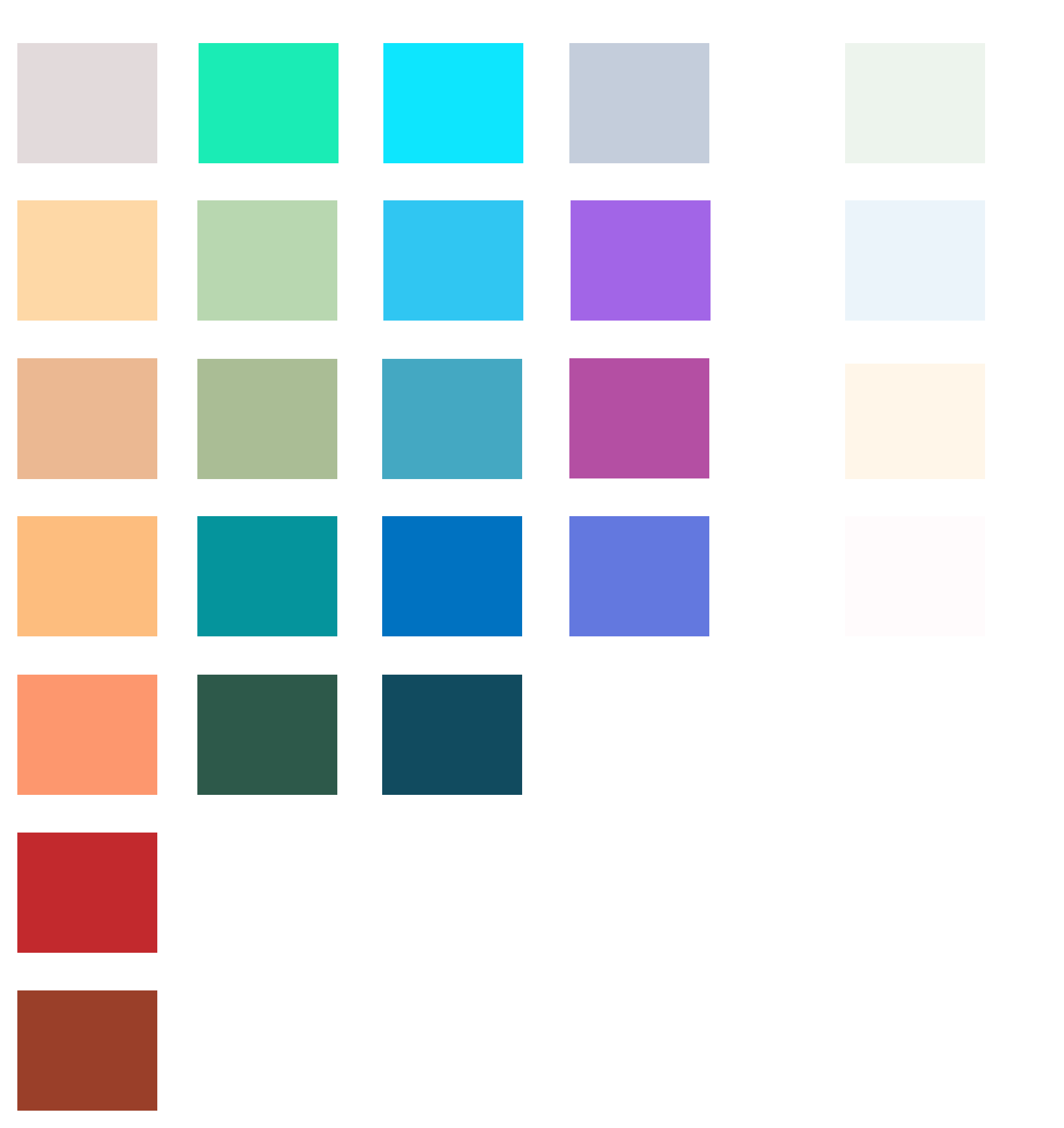
Once the most accessible options were found, color calibrations were explored. One group was eliminated due to overly high vibrancy.
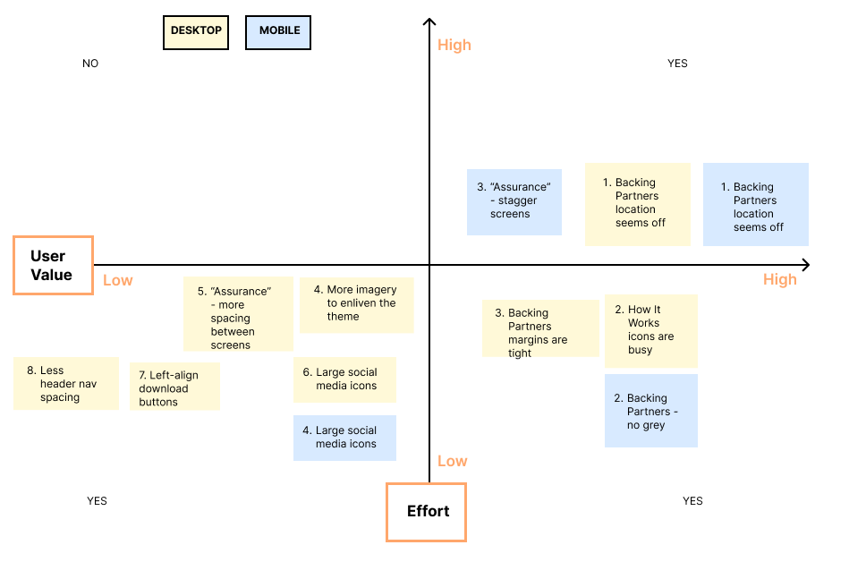
Through Peer Feedback, I mapped a design prioritization matrix which guided the changes. The resulting iterations led to the final wireframes and Content Flow Diagrams.
Although the User Stories strongly suggested the ease of requesting accessibility accommodations was very important, a digital solution could best address assurance of accessible accommodations, so the user would be sure to enjoy their live event.
Develop
Now that I had the entirety of data, I could begin the “develop” phase with Ideation, User Testing, Iterations, and Brand Development.
This process started with UI inspiration, then sketches, next wireframes, and finally a prototype.
Iterations
Home Screen sketches and UI references
Two rounds of five (5) testers each were asked to complete seven (7) chronological tasks based on the Task Flow.
A UX Usability Testing outline was referenced, including a testing script, testing notes and session output charts.
Next, issues were plotted on Design Prioritization Matrix to gauge the levels of User Value Effort needed for fixes.
Brand Development
Example of Design Prioritization Matrix
After two rounds of iterating - primarily readability issues and de-cluttering - V3 of the prototype was established.
Finally it was time to establish the color palette and wordmark - my favorite part!
Color Palette
Mood Board: Images were compiled that related to and embodied the established app adjectives of Connected, Empowered and Structured.
The groups were then organized into color neighborhoods that reflected possible outcomes from the mood board tone and feel.
Wordmark
Final prototypes were created in their native devices.
Molecules: Search & Cards
Marketing Site
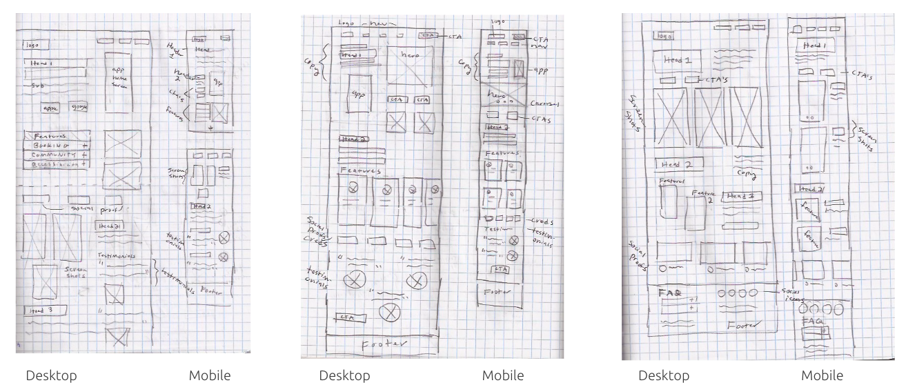
Solution sketches
Colors were extracted from the photos, and organized into groups of hue. In addition, light neutrals were needed and were created from the extracted colors.
Color neighborhoods were then tested for color-blind accessibility using the Figma Plugin “Color Blind” for Deuteranopia, the most common type of color blindness. Two neighborhoods were eliminated for not aligning with the desired app look and feel.
From the color injection exploration, two colors from separate neighborhoods had the best calibration, and portrayed the stability and friendliness desired for the app. Also, blue typically indicates wisdom, trust, and calmness which would also be applicable.
The neutral will take 60% of the design, with the teal taking 30%. Three colors with the same shade as the teal were created for category differentiation and will be the remaining 10%.
But, something didn’t feel right in the overall design. After conferring with a testee, it was determined the colors weren’t as vibrant as expected for an event app. The primary color and category colors’ saturation were increased by 10%, adding more energy to the brand.
Now that the mood and color palette were established, the brand name could be explored. This was begun by pinpointing what the app does with nouns and verbs, then exploring word combinations with various fonts.
The brainstorm exercise was translated into sketches, resulting in the top three possiblities: EventAide, EventBook, and ShowWeGo.
Ultimately, “ShowWeGo” was chosen to refine further. It exudes fun and friendliness and even sounds like “Shall we go?”. This relates back to the hypothesis that more deaf and hard of hearing people would attend more events if they had the resources and community support that this app offers.
After looking for wordmark inspiration, it was decided the primary color and a type of ticket icon should be included. Various typefaces and icons were explored.
Deliver
Application Development
From the exploration and refinement exercises, the Application Development now had a final high-fidelity prototype and application icon.. Next the UI Library, Marketing Website, and Multi Platform option were built. Lastly, the Design Impact/Future Thinking was analyzed along with Key Learnings and Next Steps.
Final High-Fidelity Prototype
UI Library
Atoms: Typeface Accessibility
Exploratory sketches
Multi Platform Challenge
First I laid out a lo-fi wireframe to establish the content hierarchy.
A prototype of the My Events page was then created in its native device.
Final Wordmark
Stacked text and the ticket icon close in proximity result in a rectangle dimension that will translate well across applications.
Organisms: Community Post
Final Application Icon
Next, a comprehensive UI Library was cataloged using the Atomic Design method, including but not limited to:
typography, typeface scale, colors, grids & spacing, iconography, buttons & inputs, components, templates and finally pages.
Poppins was chosen based on its modern, clean look and range of fonts. Although it is not he highest level of accessibility, the wide counters and kerning provide apt legibility.
SF Pro was used on the screens when smaller text was needed. This is due to the very clear legibility and familiarity from use in iOS applications and systems.
An important facet of my case study was building a marketing site to promote the newly-developed mobile application. Once again I began with UI inspiration, which led to a mood board exuding adjectives like “Fun, Welcoming, and Freeing”.
Using the Tarot Cards of Tech, I explored the social impact of my case study project.
Now that the inspiration was complete, sketches of possible layouts with annotations were created. With the Solution Sketches I laid out two versions of low-fidelity wireframes.
Link to Lo-Fi Wireframes V2 (not developed)
Then using my established brand and UI guidelines, I injected color and additional details.
The Smash Hit - What happens when 100 million people use your product?
My app would have to evolve to include multiple languages, including Sign Languages. Cultures would need to be considered, especially with a sensitive topic such as deafness or hearing loss.
The app would likely become more personalized based on machine-learning and Community input. I would have to consider how personal data is protected as well.
The Backstabber - What coulld cause people to lose trust in your product?
Data infiltration and personal data misuse could cause mistrust. Glitches and bad reviews could also cause mistrust.
The app would need to have a feedback loop and quality control measures. Reviews would need to be monitored so reputations are protected and conversations follow community guidelines.
The double-diamond design process works well for me. It reminds me of design briefs that I would work with in college. Whenever I questioned my next steps or decisions, I knew I could always go back to the parameters established in the brief. The double-diamond parallels are the How Might We question, goals and constraints.
The ambiguity of the design process takes getting used to, but as long as the foundation is laid at the beginning, the answers will eventually come.
Always design for accessibility from the start, and regularly document the process and versions created.
If I were to continue developing my application, I would incorporate more accessibility features, such as voice-to-text and video calls.
I would continue user testing of my core demo, as nuances and important information are often unknown with such a specific demographic.
My final step is to continue to refine this case study in my portfolio.
Thank you for your time!
To showcase my ability to translate the mobile interface to another platform, I designed the My Events screen on an Apple tablet. This was also an opportunity to explore another task flow within the app.


